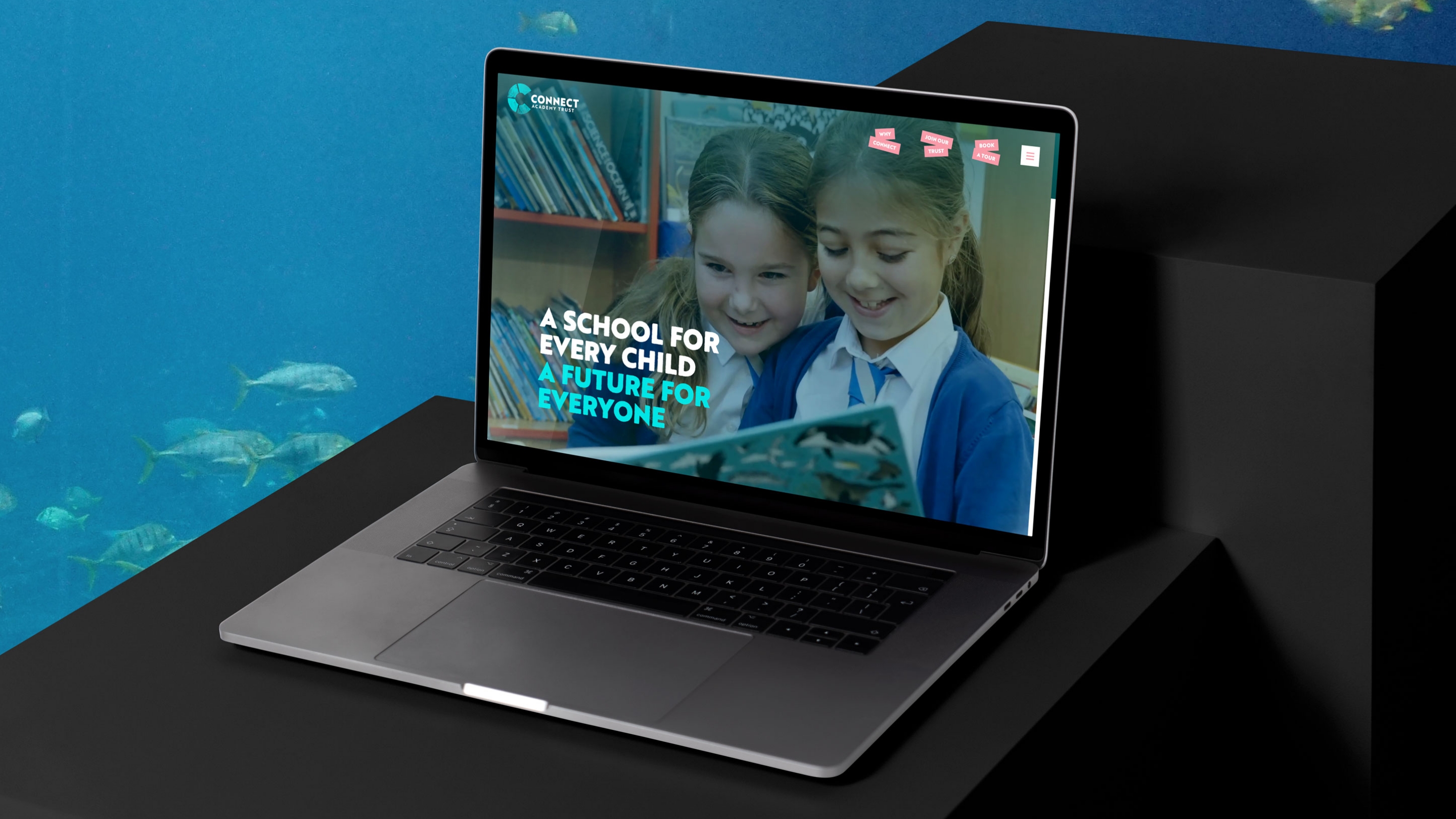
A high performing website is the icing on the cake for this ambitious trust with a deep understanding of their brand.

A small but well-respected Multi-academy Trust in Devon, Connect had grown from 5 to 8 primary schools with a clear mission: to provide values-based education that prioritised children, people, and moral purpose at every level.
On paper, the trust had everything: a passionate team, a unique Ocean Conservation Curriculum, and schools genuinely improving lives. They'd even spent 12–18 months trying to articulate what made them distinctive, landing on "A school for every child, A future for everyone."
But something fundamental was still missing. Despite the strategy work, they couldn't shake the feeling that their identity wasn't landing.
Without this clarity, the leadership team faced a series of dilemmas:
- In a competitive market where schools were choosing which trust to join, Connect couldn't quickly display why they were the right choice
- Multi-academy trusts faced growing scepticism – some had earned reputations for being corporate or numbers-focused – and Connect risked being misunderstood
- Their existing brand didn't capture Connect's unique character or communicate what being part of this trust actually meant
- Staff struggled to articulate what made Connect special, even though they felt it deeply
- Parents, governors, and schools considering joining needed reassurance that this trust would be different – values-led, not just operationally efficient
They had the DNA. They had the heart. What they lacked was the ability to consistently communicate unshakeable confidence in their identity.
What Upshot did
Discovering the real Connect
The education sector (like many others) has a habit of reaching for particular words and phrases that quickly infiltrate everyone’s language and become ubiquitous and unhelpful in differentiation.
Through discovery workshops with heads, deputies, and the core trust team, we drew together their ideas and experiences, then distilled them into common language they could relate to. This uncovered their collective identity – not by imposing one, but by drawing out what was already there and giving it clear language.
Four brand anchors
We articulated Connect's fundamental purpose, mission and vision, combining them into a creative manifesto that would inspire and unify their schools and their staff.
But more importantly, we defined how they do this through four central anchors:
Nurturing – the one about caring for people
Principled – the one about ethics and integrity
Trailblazing – the one about thinking differently
Empowering – the one about collaborative connections
Together, these simple words formed a unique recipe of values, traits and ambitions. Applied to real situations they act as decision-making criteria, prioritisation tools and behavioural best practices.
When we presented the full strategy, people really resonated. Unexpectedly, some teachers even became emotional. "That's the organisation I work for," they said.
Relief. Recognition. Pride.

Bringing it to life
The visual identity moved away from corporate MAT aesthetics entirely. We focused on the messiness and joy of creative learning – playful textures representing each anchor, linked to familiar primary school activities.
Each anchor got its own textured version of the hero typeface, and each texture was given a segment in the C-shaped logo mark. Working with illustrator Pete Clayton and Tom Carder Media for photography and videography, we created an identity that was unmistakably Connect – human, joyful, values-led.
The website, built on Webflow, gave them a modern, secure platform that stands head and shoulders above other local MATs – visually engaging, communicating clear personality and benefits, and easily updatable by the team. Analytics continue to show ongoing improvements to the site’s presence and performance.

"The way our values act as a foundation for everything we do gives us confidence and pride. Without that deep sense of identity, our positivity – even in the toughest of times – would be impossible!"


Impact
The transformation wasn't just about having nice words on a wall. When you have unshakeable confidence in your identity, everything changes. For Connect this looked like:
Operational clarity
- Anchors guide every difficult decision – from school improvement to HR and budget conversations
- "The rebrand has changed how we work because it's challenged our thinking around our values, but we are now really clear of what they are and exactly what we stand for as a trust." – Stuart Bellworthy, CEO
- "When I go into schools nervous about improvement work, I start with the values. It puts everything in context – moral purpose, not bulldozing." – Sarah Ryder, Schools Improvement Lead
Compelling differentiation
- "We always start with our anchors" when attracting schools – clarity helps partners self-select
- Added another school since rebrand, actively building relationships with more potential partners
- No longer trying to be all things to all schools – attracting values-aligned partners, not just any schools
Brand that works hard
- Playful graphics and clear guidelines make creating new assets quick and consistent
- Ongoing design retainer enables professional-grade touchpoints across all schools
- Every piece reinforces the identity
Confidence in tough times
- "The clarity gives us optimism and helps massively in the toughest times"
- Values provide something to hold onto when the sector is struggling
- "Without this, we'd be floundering" – Sarah Ryder
Human language that lands
- "Our values are human values, not educational jargon. Everybody knows what nurturing means"
- Parents, governors, and prospective schools immediately grasp what Connect stands for
- Depth behind the simplicity, but accessible on face value


